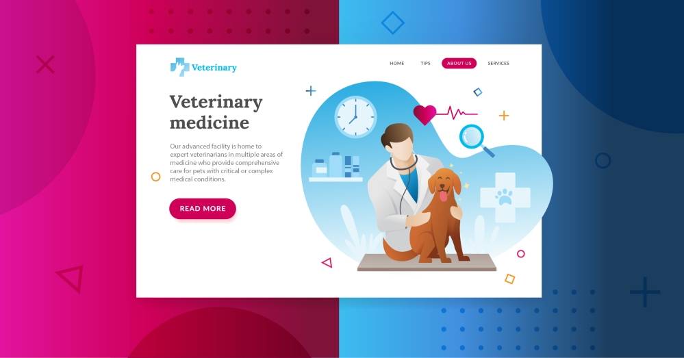
It’s 4:30 p.m., and Roxy has a sudden stomachache — Yorkies are bad about that. When her dad looks for nearby vets using voice search on his smartphone, will your practice’s site appear? And when he clicks, will it load fast and give him all the info and options he needs?
Veterinary clinic website design is the crux of your practice’s digital marketing. Every effort — from your online business listings to your social media to your ads — leads to your website.
That’s why the best veterinary website design has to meet your site visitors’ expectations to generate leads and keep your clients on the page. Let’s look at must-have factors when you want your vet website design to produce real results.
Engaging Design and Content
Learning how to make a veterinary website probably sounds like a big task. So when you think about what you should have on your veterinary website, put yourself in your clients’ shoes. What do they need from your site?
- A clear list of your services (and rates, if possible)
- Easy-to-find contact information, including your hours (and any emergency hours you might have)
- Reviews from your previous clients, which we’ll talk about more later
That’s in addition to the look and feel of your website – which you obviously want to be clean, balanced and eye catching, especially on mobile (again, more on that later).
In short, the best veterinary website design is as much about being useful as it is about looking good. That’s why so many vets partner with digital marketing companies who know all the best practices and how to make their sites look great too.
Plus, those digital marketing experts will bake in what your site needs to get found in search engines. After all, the best vet website design doesn’t mean much if no one can find it.
All of that expert care in designing and building your site means that it can appear before Dr. Smith’s down the street when Roxy’s dad searches on Google, Bing or Yahoo.
[Related: Everywhere You Need To Advertise Online]
Reviews, Testimonials and Star Ratings
Do you know how clients find the best veterinary websites? Odds are they scan reviews and click the highest-rated vet clinic closest to their home.
In fact, 99% of consumers read online reviews when looking for services.
With that in mind, veterinarian website design should have client reviews front and center.
So after you soothe Roxy’s stomachache and her dad’s nerves, ask for a review. Then ask your next client for one (and the next and the next). As they start rolling in, digital marketing tools let you easily request reviews and post them everywhere… and we mean everywhere:
- Your website
- Your online business listings
- Your social media accounts and posts
- Your online ads
- Email newsletters and other reminders
Reviews and your reputation are key to landing new clients, so don’t be afraid to show off! In the end, Roxy’s relieved... her dad’s relaxed... and your practice gets a serious word-of-mouth boost.
[Related: 5 Reasons Why You Need To Focus on Online Reviews Now]
Mobile Optimization and Voice Search Compatibility
Even if you’re don’t frequently use your phone or voice search to look for services, your clients probably do. Consider this:
- Roughly 97% of Americans own smartphones
- Of all those people with smartphones, 71% would rather use voice search than type
- Only 1% of smartphone users said they didn’t use their phone to search online for local businesses
Missing out on the remaining 99% isn’t just a shame — it could be a real missed opportunity for your practice. And it’s a serious reason why you shouldn’t tackle website design for vets on your own.
Clearly, your veterinary website design has to meet two needs:
- Look professional and function seamlessly on mobile devices
- Work with voice search devices
In other words, your website must communicate with search engines when Roxy’s dad asks Alexa about nearby vets. If it doesn’t, the next step is nil. When he clicks your URL, he should be able to easily see your key info on his phone.
After all, few things turn off clients more than squinting or zooming to see whether you’re open. And that’s doubly true when they’re having a stressful pet moment.
[Related: Why Professional Web Designers Are Better Than DIY Tools]
Security Credentials and Forms
It almost goes without saying, but we’ll say it anyway — veterinary website design best practices aren’t complete with digital security.
Something as simple as an SSL certificate can give your clients peace of mind when they’re sharing their name and address with you — let alone their payment details.
To cement trust and communicate with your clients even more, your vet website design can offer additional secure options:
- Booking and scheduling forms
- Contact and inquiry forms
- Safe payment options (like PayPal)
The client info you collect on those contact forms can then be used for marketing automation — a potentially lucrative veterinary website design tactic. All of design these features work together to increase your practice’s marketing ROI and instill client confidence (which is priceless for any pet parent).
[Related: Today’s Website: Free Guide for Small Businesses]
Cut the Fluff — Get the Best Veterinary Website Design With Hibu
The ideal vet website design is a design that grows your practice. A Hibu Smart Site can increase your digital visibility, attract new leads and engage your patients (okay, probably their owners). Plus, all of our digital solutions integrate to deliver better marketing results.
When you’re ready to embrace what professional web design can do for your veterinary clinic, call us at 877-237-6120 or complete our Get Started form for a free, no-obligation consultation.


