Does your website have what it takes to grow your business?
Your Hibu Smart Site isn’t JUST a pretty picture. It’s an important tool you rely on to convert prospects into customers. Your website is probably the #1 way your customers interact with your business…and certainly the most important factor in how your potential customers will judge your business.
Sure, both prospects and customers expect your site to look good, but visitors will only stay on your site if it’s easy to use, if it makes it easy to find the information they need to know — the same information that most likely drove them to your site in the first place:
- Who you are – it better be instantly apparent
- Where you are – let them know you’re near by
- What you do – you’ve got seconds to tell them you can deliver what they need
- How to get in touch with you – make it easy and give them choices
Take a look at what’s built into every Hibu Smart Site – basically, all the things that make a Smart Site smart. We’ve built tens of thousands of websites for small businesses, all across the country, in a wide range of industries. These are the fundamental components we’ve seen work best to make sure your site visitors can immediately answer those 4 key questions – whether they’re on a computer, phone, or tablet (even if they’re using voice search).
[Related: Why Consumers Choose One Small Business Over Another]
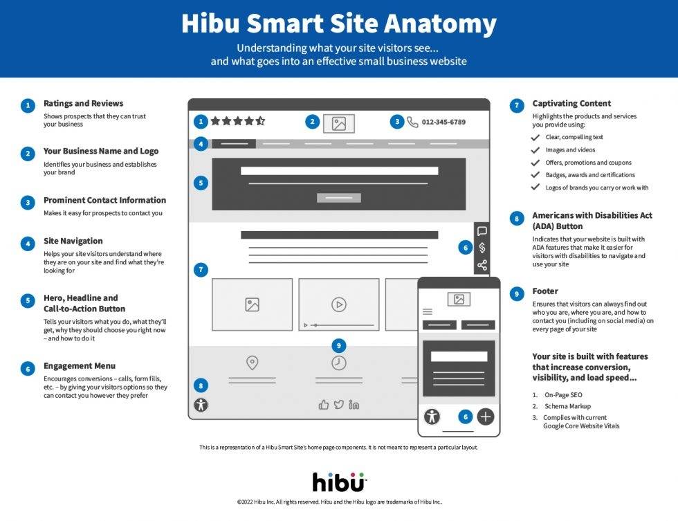
The Hibu Smart Site Anatomy
Understanding what your site visitors see… and what goes into an effective small business website.
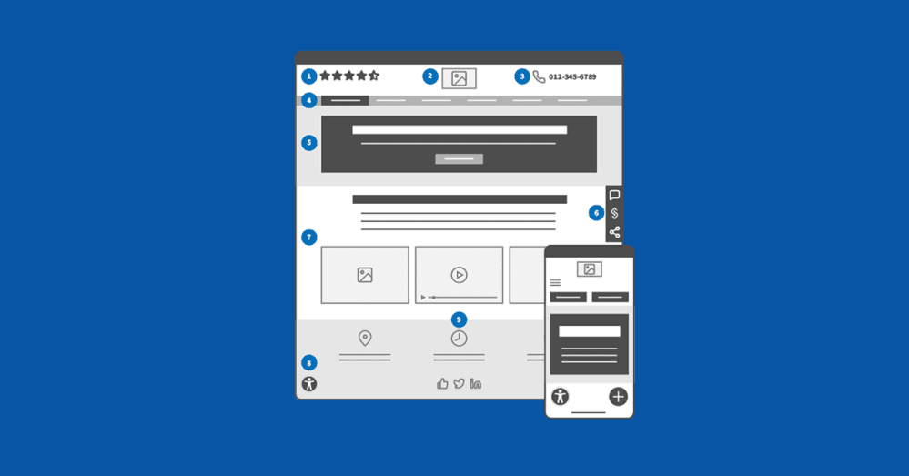
1) Ratings and Reviews: Showing customer reviews at the very top of the website is the fastest way to assure visitors and prospects that they can trust your business. Trustpilot reports that almost 90% of consumers read reviews before buying a product, and goes on to say “Reviews are an opportunity for anyone familiar with your brand to publicly share what they love about your products [and] services.”
2) Your Business Name and Logo: Your website’s first job is to introduce your business to site visitors – who you are and what you do. By clearly presenting your business name and brand logo, you not only identify your business and establish your brand, but you instantly confirm that the visitor is in the right place for the products and services they’re searching for.
3) Prominent Contact Information: The ultimate goal of your website is to drive leads to your business. That may sound like a simple idea, but far too many business websites make it hard for the prospect to contact the business. Your site needs to make it easy for prospects to contact you. Don’t make a visitor hunt for your phone number – put it at the very top of your Home page where it’s immediately visible.
4) Site Navigation: The navigation links at the top of your Home page serve two functions. First, it helps your site visitors understand where they are on your website now and it’s the simplest way for them to get to the internal pages of your site. And second, your navigation tells visitors what services you provide. In many ways it’s a menu of what your business offers.
5) Hero, Headline and Call-to-Action Button: Don’t make visitors guess what you do. If they’re not sure they’re in the right place they will click away to your competition. The large top section of your Home page is a billboard and it should clearly tell your visitors four things: 1) what you do, 2) what they’ll get, 3) why they should choose you right now, and 4) how to contact you to get what they want.
6) Engagement Menu: It’s not enough today to just show a phone number. In order to maximize leads and drive consumers to your business, you need to do everything you can to encourage conversions. Give visitors options so they can contact you the way they want – whether they are most comfortable calling, filling out a form, or any of a number of other options. By giving your visitors options so they can contact you however they prefer, they are more likely to contact you now.
7) Content: The bulk of your site is made up of “content” – text and images that highlight the products and services you provide. You can quickly communicate what you do, deals you offer, and reasons to trust you, by including:
- Images and videos
- Offers, promotions and coupons
- Badges, awards and certifications
- Logos of brands you carry or work with
8) Americans with Disabilities Act (ADA) Button: You want every site visitor to be able to easily navigate your site. The ADA button indicates that your website is built with ADA features that make it easier for visitors with disabilities to navigate and use your site.
9) Footer: There are two things that appear in the same position on every page of your site – your navigation and your footer. A well-constructed footer ensures that visitors can always find out key information about your business – who you are, where you are, and how to contact you (including on social media) – and they can find it on every page of your site.
Remember, about three in four consumers (76%) will search for a company website before deciding to visit their physical location. Your website must be designed to quickly communicate the important information your site visitors are looking for… and that’s what a Hibu Smart Site does.
[Related: 10 Missing Pieces on Small Business Websites]
What Your Website Visitors Can’t See Matters Too
What visitors (aka your customers, clients or patients) see on your site should convince them to trust and choose you…but getting found online has as much to do with what’s “under the hood.”
A truly smart site needs to be powered by the right technology and features, like:
- Mobile friendly design
- On-Page SEO
- Schema markup
- Adherence to website best practices, like Google’s Core Web Vitals
- Reliable hosting and domain management
Without pieces like these, it can be an uphill battle to get your site seen by your target audience. And a website that no one can find can be more frustrating than no website at all.
Is Your Site a Smart Site?
Use this Hibu Smart Site Anatomy to compare the business website you have to the site you need… one built to turn visitors into customers.
- Customer Ratings and Reviews
- Your Business Name and Logo
- Prominent Contact Information
- Clear Site Navigation
- Eye-Catching Hero Image, Headline and Call-to-Action Button
- Engagement Menu with Contact Options
- Captivating Content
- Clear, compelling text
- Images and videos
- Offers, promotions and coupons
- Badges, awards and certifications
- Logos of brands you carry or work with
- Americans with Disabilities Act (ADA) Button and Features
- Informative Footer


