When you’re building a small business, your website is a vital component to marketing your brand. Even the smallest mistakes in web design can discourage potential customers from doing business with you.
If you’re thinking about a new website design for your local business, avoid these common mistakes:
- Overly busy design — You need to make sure your website design is simple and easy to navigate, so when someone visits your site they can easily find what they want. This prevents confusion — customers usually already know what they’re looking for when they come to your website. Make it as easy as possible for them to find it. According to Forbes magazine, “If within three seconds they can’t figure out what to do next, you might need to go back to the drawing board.”
- Missing the mark and your market — Small business websites often forget who they’re talking to. Make sure your site design makes sense for the type of customers you serve, and/or the type of customers you hope to start serving. From the color choices to the photography to the content, your site needs to “make sense” for your audience.
- Content is key — The content (or “copy”) on your website is just as important as the visual design, and balancing the two can make or break a “good” website. Your content explains the services your company provides – which is what your site visitors are online looking for. Up to date, complete, helpful and unique content is also what search engines look for, so you’re really doing two favors for yourself by keeping content in mind in your website design.
- Clear and concise call to action — When a customer comes across your website, do you want them to buy a product, subscribe to an email list, or call your company? Be clear about what you want them to do and why it will benefit them — and include it on every page of your site, not just your home page or contact page.
Inc.com put together a great article about poor website design. Here are some of the highlights:
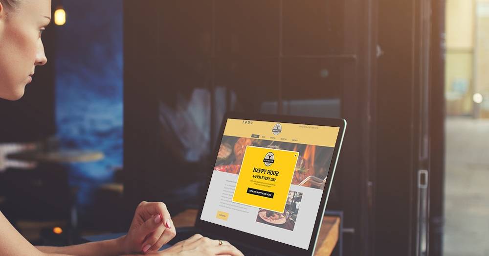
Images Are Not High Res*
Your iPhone has a HD camera on it. Gone are the excuses of why your images aren’t high quality.
*“High Res” meaning “high quality.” Your site images should be optimized for desktop, tablets and smartphones to look sharp and clear on every device – just like they are on a Hibu Website.
Auto Play
Whether it’s music (what is this, the 90s?), video or narration, if you take the control away from your visitor, you’re basically insulting them.
Anything Flash
Come on…I don’t want to download a program simply to look at your site.
No (obvious) Social Links
EVERY BUSINESS NEEDS SOCIAL MEDIA. A digital footprint is critical and social pages are an important part of building that footprint. But like footprints in the sand, the impact of social will be washed away by the tide if no one can find them. Use your website real estate wisely and promote your social links.
Not Responsive
If your first response to this was, “I get back to people within 24 hours,” you’re in trouble. Making sure your website is responsive means it can be viewed easily on any platform: desktop, laptop, tablet or mobile.
Wrong or Missing Contact Info
There are 1000+ other people in this world that probably do what you do. If your customer/client can’t figure out how to get in touch with you easily, they will move on to the next. Make sure your contact information is clearly visible on every page…unless you’re in the CIA.
Copy Heavy
If you have paragraph upon paragraph of information on your site, I’ve either bounced off or fallen asleep. The truth is that people don’t read and really don’t care that much about you or your product. What they do care about is how it will help them, so make sure your copy is customer centric and not just a place for you to air your ego.
Blog or Media Pages With No Content
If you are going to build a page, populate it and keep it up to date. Otherwise take it down. It’s doing more harm than good.
Clever But Pointless Navigation
People are inherently simple, especially when you’re trying to market to them. If I can’t figure out how to contact you or what your services page is because you’re trying to be creative and clever, you’ve really just frustrated me. I get it, you’re an “out of the web” thinker…next option, please.
No Call to Action
Why am I here and what do you want me to do = Marketing 101
Ready for some professional web design help? Talk to Hibu’s local digital marketing experts today about a custom website for your small business.